Infographics are becoming an important tool for communicating information in website design, brochure design, presentations, annual reports, strategic reports, and other marketing materials, because nobody has time anymore to read long blocks of text or to figure out complex data. Infographics are more engaging and information is communicated visually which makes the content faster to read and easier to retain. Infographics can vary dramatically from a simple icon to complex data charts with custom illustration. But how do you start an infographic? Starting an infographic turns out to be an intimidating obstacle for our clients to approach an infographic project.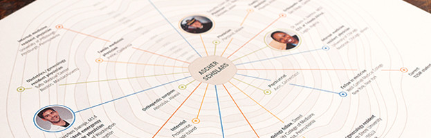
Start with wireframes
The visual design of an infographic is very important. But it is not the focus in our approach for infographics until the strategic aspect of the graphic design — the information architecture and content — is resolved. The goal of an infographic is communicating complex data and information, so getting the structure and content right is the most important. The visual design can distract and “hide” content/structure flaws, so we focus on the content first.
Wireframing is an approach used in web and app design, but we use the same approach for starting infographics.
Wireframing disregards the visual design and focuses on the information architecture: the content and structure of the information. And that is the the best place to start for infographics.
Ask a lot of questions
- What data is available?
- What’s the conclusion you want the audience to draw? What’s the most important point you want to make?
- What are sub themes and how do they relate to the infographic overall and each other?
- Who is the audience and what requirements do they have?
- Is the infographic designed for print or web?
- What is the text content you need to include in the infographic?
- How can the content and data be organized in a purposeful structure?
There are many more questions that can be asked, and for each infographic they vary, but answering these will lead to a great start for the wireframe of an infographic.
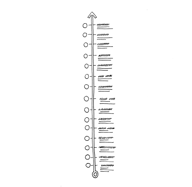
Structure Sketches
With this information, we create sketches that show the content/data, structure and hierarchy established to test if the information architecture is successful. Creating sketches for the infographic is very helpful in identifying if the assumptions are working or if some adjustments are necessary. Often there are multiple sketches to explore a variety of structural approaches.
Graphic Design
When the wireframe is approved, it’s time to start the visual design. We discuss the look and feel, branding, color palette, typographic, custom illustration or photography and any other design aspects that drive the design.
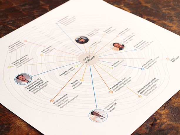
Example of wireframes and the graphic design of an infographic.
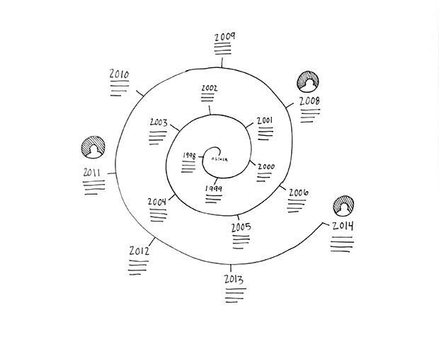
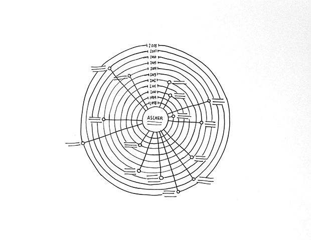
Below you see the wireframe sketches we created for an infographic for Tufts University. And below the sketches the final graphic design for the infographic. You can see multiple approaches that were considered for the organization of the information. A traditional timeline was considered in the first of the wireframe sketches but the team decided the structure of the organic rings similar to the pattern in a crosscut off a tree trunk (sketch 3) would be a more successful design because it suggests growth and expansion. The timeline is one aspect of the information, but the ultimate goal was to communicate the impact the different timeline entries made, so this expanding structure was the most successful.
See other infographics we have created in our portfolio.